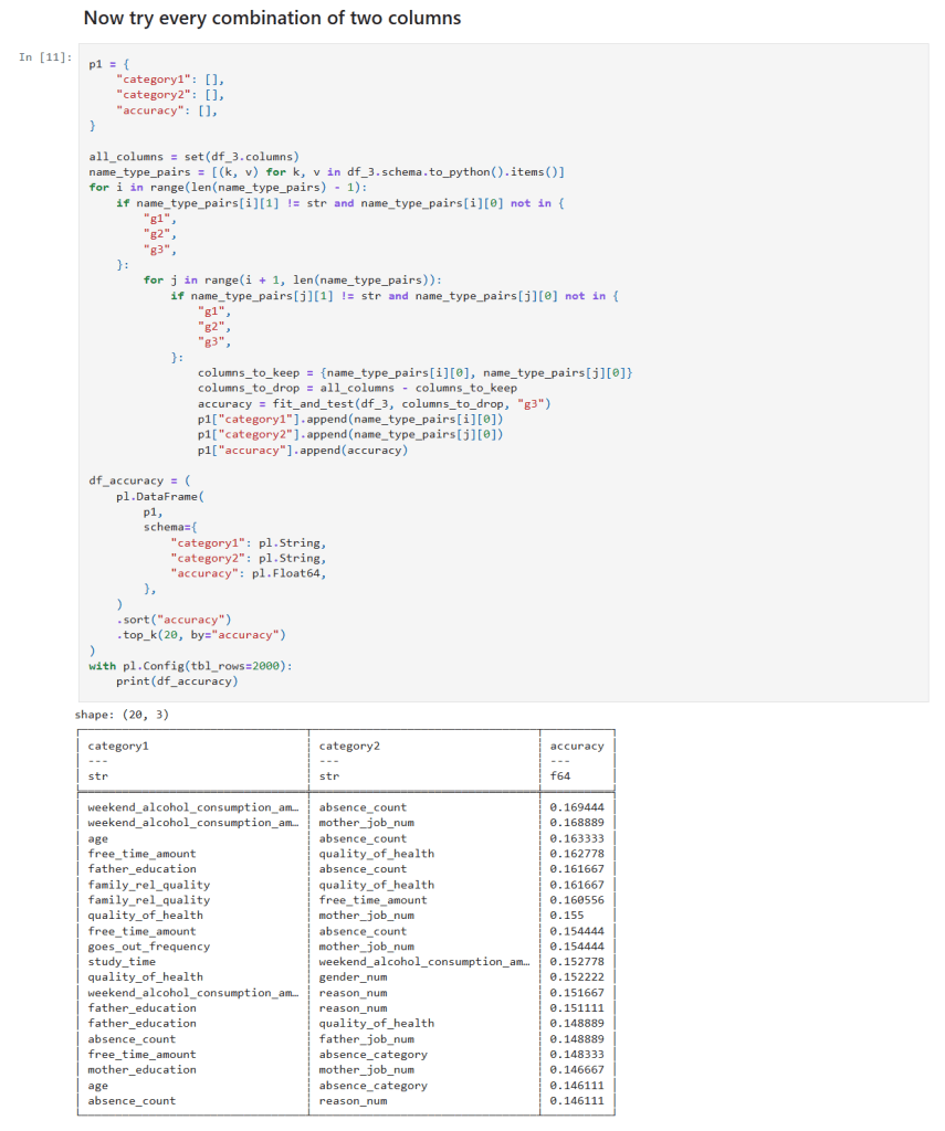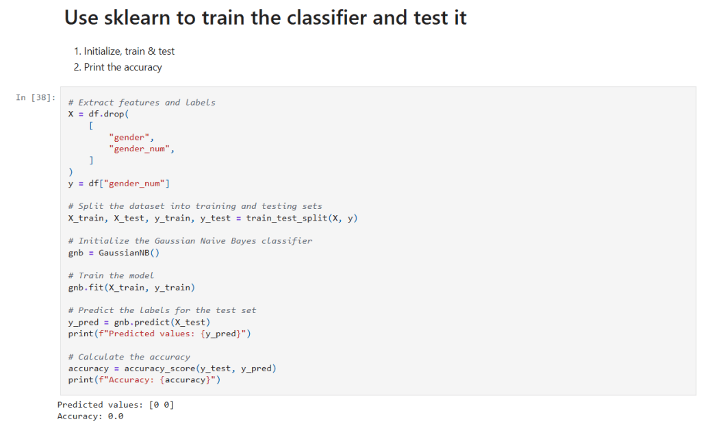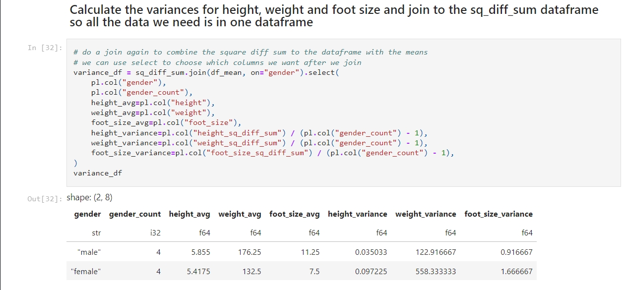
After building a genetic algorithm from scratch in Jupyter, I wanted to see what would happen if I used a library instead. Specifically, I tried out sklearn-genetic, a tool that wraps genetic feature selection into a few clean lines of code.
The difference is incredible. My original notebook was over one hundred lines of code. With sklearn-genetic, the same process became a single call:
selector = GAFeatureSelectionCV( estimator=DecisionTreeClassifier(random_state=RANDOM_STATE), cv=CROSS_VALIDATION_SPLITTING, scoring=SCORING_STRATEGY, population_size=POPULATION_SIZE, generations=NUM_GENERATIONS, mutation_probability=MUTATION_RATE,)selector.fit(X, y)
It worked beautifully. But it’s worth thinking about what I gained and lost with the different approaches.
What the Library Does Well
- Speed of implementation: No need to write selection, crossover, or mutation logic. It’s all built in.
- Robustness: It easily handles edge cases, parallelism, and scoring strategies.
- Integration: Fits seamlessly into scikit-learn pipelines and workflows.
- Convenience: You can run a full GA in minutes, with clean syntax and very little code.
Certainly the library has some big advantages, as libraries really should! 😀
What I Missed from Building It Myself
- Visibility: In my notebook, I saw every generation evolve. With the library, that process is hidden.
- Control: I had access to the state of the system at all times, so I could change parameters or visualize data in the middle of a run.
- Learning: Writing the GA by hand taught me how each operator affects convergence, diversity, and exploration.
- Philosophy: My notebook felt like a real experiment. The library felt like a tool.
The approaches serve different purposes. But if your goal is to actually learn genetic algorithms, building one yourself is irreplaceable.
Side-by-Side Summary
| Aspect | Hand-Built GA | sklearn-genetic |
| Transparency | Full control over internals | Abstracted |
| Flexibility | Easy to customize logic | Limited to API |
| Speed | Slower to build, faster to understand | Faster to run, harder to inspect |
| Learning Value | High | Moderate |
Final Thoughts
Using sklearn-genetic felt like using any library, you hand off control. It’s efficient, clean, and powerful. But building the algorithm myself taught me how the engine works, how selection pressure shapes populations, how mutation keeps diversity alive, and how exploration leads to clarity.
If you’re just trying to get results, use the library.
If you’re trying to understand the process, build it yourself.
And if you’re trying to do both — start with the notebook, then graduate to the tool.
– William
My notebook can be found in my GitHub repo here:


