Category: Random Forest

  • First Experiment with SHAP Visualizations

    First Experiment with SHAP Visualizations

    In my previous post, I touched on model explainability. One approach for feature attribution is called SHAP, SHapley Additive exPlanations. In this post I will cover my first experiment with SHAP, building on one of my previous notebooks. My GitHub repo containing all of my Jupyter notebooks can be found here: GitHub – wcaubrey/learning-naive-bayes.

    What is SHAP

    SHAP (SHapley Additive Explanations) is a powerful technique for interpreting machine learning models by assigning each feature a contribution value toward a specific prediction. It’s grounded in Shapley values from cooperative game theory, which ensures that the explanations are fair, consistent, and additive.

    What SHAP Does

    • It calculates how much each feature “adds” or “subtracts” from the model’s baseline prediction.
    • It works both locally (for individual predictions) and globally (across the dataset).
    • It produces visualizations like force plots, summary plots, and dependence plots.

    What SHAP Is Good For

    • Trust-building: Stakeholders can see why a model made a decision.
    • Debugging: Helps identify spurious correlations or data leakage.
    • Fairness auditing: Reveals if certain features disproportionately affect predictions for specific groups.
    • Feature attribution: Quantifies the impact of each input on the output.

    Ideal Use Cases

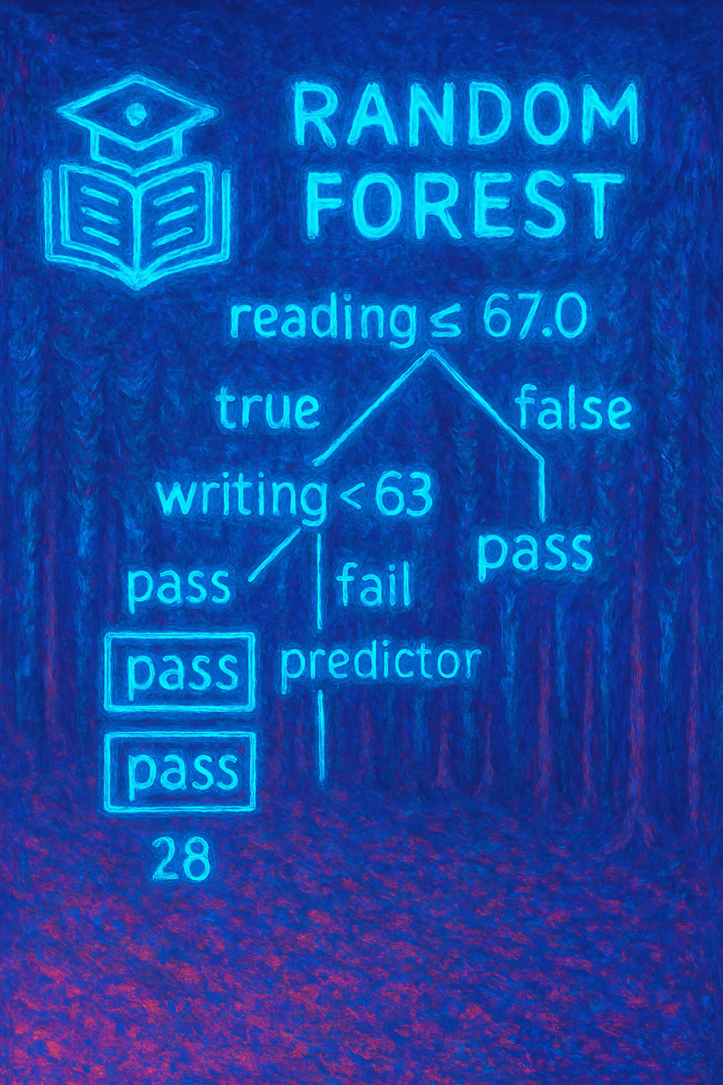
    • Tree-based models (e.g., XGBoost, LightGBM, Random Forest)
    • High-stakes domains like healthcare, education, finance, and policy
    • Any scenario where transparency and accountability are critical
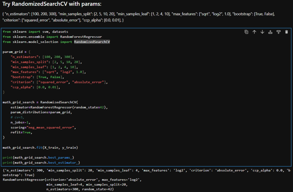
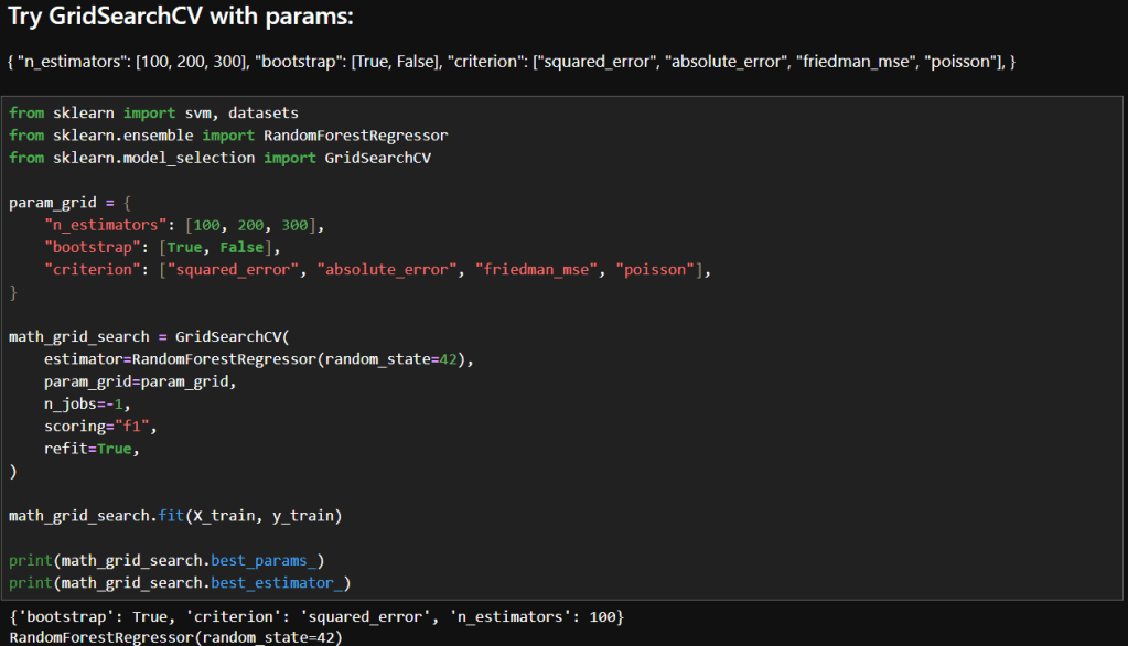
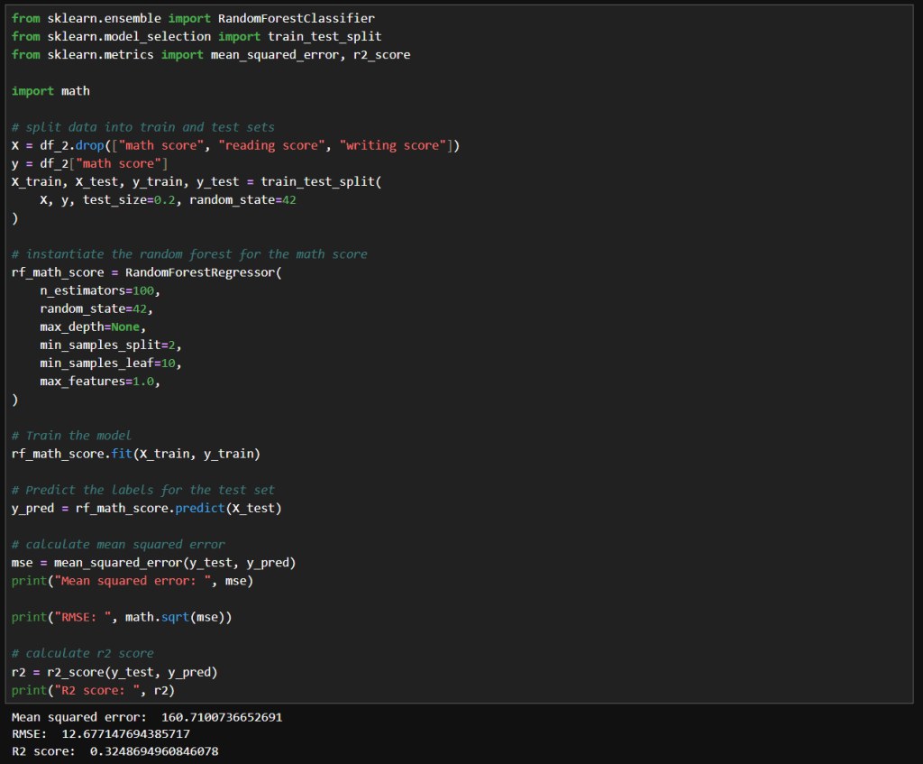
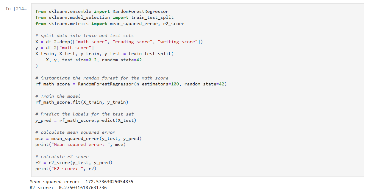
    My notebook changes

    In this new cell, I use the results of the previous grid search to create a SHAP TreeExplainer from the shap package. With that I create three different types of plots: a summary beeswarn, dependence and force plot.
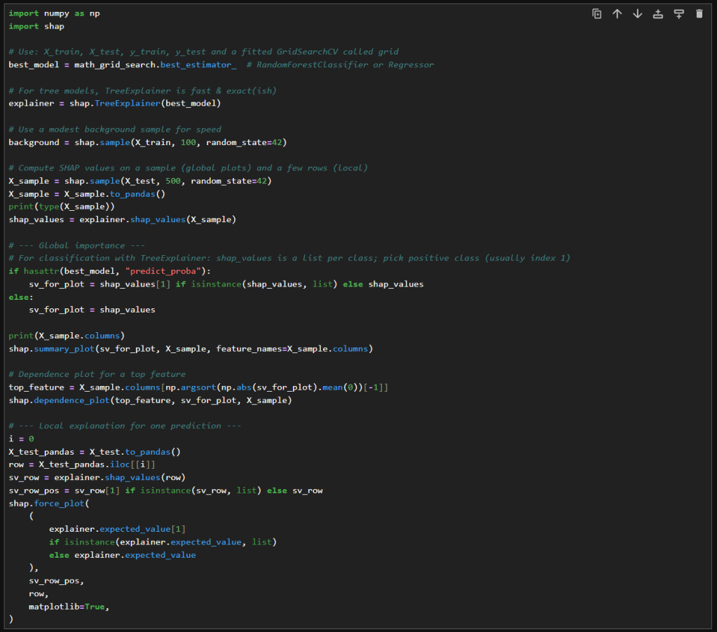
    SHAP Visualizations

    Interpreting the summary beeswarm plot

    The x-axis shows the SHAP values. Positive values push the prediction higher, towards the positive class or higher score. Negative values push the prediction lower.

    The y-axis shows the features, ranked by overall importance. The most important features are at the top. The spread of SHAP values shows how much influence that feature can have. The wider the spread of dots along the x-axis, the more variability that feature contributes to predictions. Narrow spreads mean the feature has a consistent, smaller effect.

    Each dot represents a single observation for the feature. The color of the dots shows the feature value. Red for high values and blue for low.

    If high feature values (red dots) cluster on the right (positive SHAP values), then higher values of that feature increase the prediction. If high values cluster on the left, then higher values decrease the prediction. Blue dots (low feature values) show the opposite effect.

    Overlapping colors can suggest interactions. For example, if both high and low values of a feature appear on both sides, the feature’s effect may depend on other variables.

    Interpreting the force plot

    The base value is the average model prediction if no features were considered. It’s like the starting point. It is the neutral prediction before considering any features.

    Arrows or bars are the force each feature contributes positively or negatively to the prediction. Each feature either increases or decreases the prediction. The size of the arrow/bar shows the magnitude of its effect.

    • Red (or rightward forces): Push the prediction higher.
    • Blue (or leftward forces): Push the prediction lower.

    The final prediction is the sum of the baseline plus all feature contributions. The endpoint shows the model’s actual output for that instance

    – William

    References

  • Hyperparameter tuning with RandomizedSearchCV

    Hyperparameter tuning with RandomizedSearchCV

    In my previous post, I explored how GridSearchCV can systematically search through hyperparameter combinations to optimize model performance. While powerful, grid search can quickly become computationally expensive, especially as the number of parameters and possible values grows. In this follow-up, I try a more scalable alternative: RandomizedSearchCV. By randomly sampling from the hyperparameter space, this method offers a faster, more flexible way to uncover high-performing configurations without the exhaustive overhead of grid search. Let’s dive into how RandomizedSearchCV works, when to use it, and how it compares in practice.

    What is RandomizedSearchCV

    Unlike GridSearchCV, which exhaustively tests every combination of hyperparameters, RandomizedSearchCV takes a more efficient approach by sampling a fixed number of random combinations from a defined parameter space. This makes it useful when the search space is large or when computational resources are limited. By trading exhaustive coverage for speed and flexibility, RandomizedSearchCV often finds competitive, or even superior, parameter sets with far fewer evaluations. It’s a smart way to explore hyperparameter tuning when you want faster insights without sacrificing rigor.

    Hyperparameter Tuning with RandomizedSearchCV

    Here’s a breakdown of each parameter in my param_distributions for RandomizedSearchCV when tuning a RandomForestRegressor:

    ParameterDescription
    n_estimators [100, 200, 300]Number of trees in the forest. More trees can improve performance but increase training time.
    min_samples_split [2, 5, 10, 20]Minimum number of samples required to split an internal node. Higher values reduce model complexity and help prevent overfitting.
    min_samples_leaf [1, 2, 4, 10]Minimum number of samples required to be at a leaf node. Larger values smooth the model and reduce variance.
    max_features ["sqrt", "log2", 1.0]Number of features to consider when looking for the best split. "sqrt" and "log2" are common heuristics; 1.0 uses all features.
    bootstrap [True, False]Whether bootstrap samples are used when building trees. True enables bagging; False uses the entire dataset for each tree.
    criterion ["squared_error", "absolute_error"]Function to measure the quality of a split. "squared_error" (default) is sensitive to outliers; "absolute_error" is more robust.
    ccp_alpha [0.0, 0.01]Complexity parameter for Minimal Cost-Complexity Pruning. Higher values prune more aggressively, simplifying the model.

    Interpretation

    Here is a table that compares the results in my previous post where I experimented with GridSearchCV with what I achieved while using RandomizedSearchCV.

    MetricGridSearchCVRandomizedSearchCVImprovement
    Mean Squared Error (MSE)173.39161.12↓ 7.1%
    Root Mean Squared Error (RMSE)13.1712.69↓ 3.6%
    R² Score0.27160.3231↑ 18.9%

    Interpretation & Insights

    Lower MSE and RMSE:
    RandomizedSearchCV yielded a model with noticeably lower error metrics. The RMSE dropped by nearly half a point, indicating better predictions. While the absolute reduction may seem modest, it’s meaningful in contexts where small improvements translate to better decision-making or cost savings.

    Higher R² Score:
    The R² score improved from 0.27 to 0.32, a relative gain of nearly 19%. This suggests that the model tuned via RandomizedSearchCV explains more variance in the target variable—an encouraging sign of better generalization.

    Efficiency vs Exhaustiveness:
    GridSearchCV exhaustively evaluated all parameter combinations, which can be computationally expensive and potentially redundant. In contrast, RandomizedSearchCV sampled a subset of combinations and still outperformed grid search. This underscores the value of strategic randomness in high-dimensional hyperparameter spaces.

    Model Robustness:
    The improved metrics hint that RandomizedSearchCV may have landed on a configuration that better balances bias and variance—possibly due to more diverse sampling across parameters like min_samples_leaf, criterion, and ccp_alpha.

    Takeaways

    RandomizedSearchCV not only delivered better predictive performance but did so with greater computational efficiency. When I ran GridSearchCV with as many parameters to explore, it ran for a long time. In contrast, RandomizedSearchCV returned almost instantaneously in comparison. For large or complex models like RandomForestRegressor, this approach offers a good balance between exploration and practicality. It’s a great reminder that smarter search strategies can outperform brute-force methods—especially when paired with thoughtful parameter ranges.

    – William

  • Trying my hand at Hyperparameter tuning with GridSearchCV

    Trying my hand at Hyperparameter tuning with GridSearchCV

    In this post, I’ll try using scikit’s GridSearchCV to optimize hyperparameters. GridSearchCV is a powerful tool in scikit-learn that automates the process of hyperparameter tuning by exhaustively searching through a predefined grid of parameter combinations. It evaluates each configuration using cross-validation, allowing you to identify the settings that yield the best performance. It doesn’t guarantee the globally optimal solution, but GridSearchCV provides a reproducible way to improve model accuracy, reduce overfitting, and better understand how a model responds to different parameter choices

    Hyperparameter Tuning with GridSearchCV

    First Attempt

    The images below show the initial parameters I used in my GridSearchCV experimentation and the results. Based on my reading, I decided to try just a few parameters to start. Here are the parameters I chose to start with and a brief description of why I felt each was a good place to start.

    ParameterDescriptionWhy It’s a Good Starting Point
    n_estimatorsNumber of trees in the forestControls model complexity and variance; 100–300 is a practical range for balancing performance and compute.
    bootstrapWhether sampling is done with replacementTests the impact of bagging vs. full dataset training—can affect bias and variance. Bagging means each decision tree in the forest is trained on a random sample of the training data.
    criterionFunction used to measure the quality of a splitOffers diverse loss functions to explore how the model fits different error structures.

    You may recall in my earlier post that I achieved these results during manual tuning:
    Mean squared error: 160.7100736652691
    RMSE: 12.677147694385717
    R2 score: 0.3248694960846078

    Interpretation

    My Manual Configuration Wins on Performance

    • Lower MSE and RMSE: Indicates better predictive accuracy and smaller average errors.
    • Higher R²: Explains more variance in the target variable.

    Why Might GridSearchCV Underperform Here?

    • Scoring mismatch: I used "f1" as the scoring metric, which I discovered while reading, is actually for classification! So, the grid search may have optimized incorrectly. Since I’m using a regressor, I should use "neg_mean_squared_error" or "r2".
    • Limited search space: My grid only varied n_estimators, bootstrap, and criterion. It didn’t explore other impactful parameters like min_samples_leaf, max_features, or max_depth.
    • Default values: GridSearchCV used default settings for parameters like min_samples_leaf=1, which could lead to overfitting or instability.

    Second Attempt

    In this attempt, I changed the scoring to neg_mean_squared_error. What that does is, it returns the negative of the mean squared error, which makes GridSearchCV minimize the mean square error (MSE). That in turn means that GridSearchCV will choose parameters that minimize large deviations between predicted and actual values.

    So how did that affect results? The below images show what happened.

    While the results aren’t much better, they are more valid because it was a mistake to use F1 scoring in the first place. Using F1 was wrong because:

    • The F1 score is defined for binary classification problems. and I am fitting continuous outputs.
    • F1 needs discrete class labels, not continuous outputs.
    • When used in regression, scikit-learn would have forced predictions into binary labels, which distorts the optimization objective.
    • Instead of minimizing prediction error, it tried to maximize F1 on binarized outputs.

    Reflections

    • The "f1"-optimized model accidentally landed on a slightly better MSE, but this is not reliable or reproducible.
    • The "neg_mean_squared_error" model was explicitly optimized for MSE, so its performance is trustworthy and aligned with my regression goals.
    • The small difference could simply be due to random variation or hyperparameter overlap, not because "f1" is a viable scoring metric here.

    In summary, using "f1" in regression is methodologically invalid. Even if it produces a superficially better score, it’s optimizing the wrong objective and introduces unpredictable behavior.

    In my next post I will try some more parameters and also RandomizedSearchCV.

    – William

  • Playing with Hyperparameter Tuning and Winsorizing

    Playing with Hyperparameter Tuning and Winsorizing

    In this post, I’ll revisit my earlier model’s performance by experimenting with hyperparameter tuning, pushing beyond default configurations to extract deeper predictive power. I’ll also take a critical look at the data itself, exploring how winsorizing outliers can recalibrate outliers without sacrificing the integrity of the data. The goal: refine, rebalance, and rethink accuracy.

    Hyperparameter Tuning

    The image below shows my initial experiment with the RandomForestRegressor. As you can see, I used the default value for n_estimators.

    The resulting MSE, RMSE and R² score are shown. In my earlier post I noted what those values mean. In summary:

    • An MSE of 172 indicates there may be outliers.
    • An RMSE of 13 indicates there an average error of around 13 points on 0–100 scale.
    • An R² of 0.275 means my model explains just 27.5% of the variance in the target variable.

    Experimentation

    My first attempt at manual tuning looked like the image below. There really is just a small improvement with these parameters. I tried increasing n_estimators significantly because the accuracy should be improved with the larger value. I tried increasing max_depth to 50 to see if that compares to the default value of None. I tried increasing min_samples_split to 20 and min_samples_leaf of 10 to see if it would help with any noise in the data. I didn’t really need to set max_features to 1.0, because that is currently the default value.

    The net result was slightly better results, but nothing too significant.

    Next, I tried what is shown in the image below. Interestingly, I got very similar results to the above. With these values, the model trains much faster while achieving the same results.

    Winsorizing

    Winsorization changes a dataset by replacing outlier values with less extreme ones. Unlike trimming (which removes outliers), winsorization preserves the dataset size by limiting values at the chosen threshold.

    Here is what my code looks like:

    In this cell, I’ve replaced the math score data a winsorized version. I used the same hyperparameters as before. Here we can see a more significant improvement MSE and RMSE, but a slightly lower R² score.

    That means that since the earlier model has a slightly higher R², it explains a bit more variance relative to the total variance of the target variable. Maybe because it models the core signal more tightly, even though it has noisier estimates.

    The winsorized model, with its lower MSE and RMSE indicate better overall prediction accuracy. This is nice when minimizing absolute error matters the most.

    Final Thoughts

    After experimenting with default settings, I systematically adjusted hyperparameters and applied winsorization to improve my RandomForestRegressor’s accuracy. Here’s a concise overview of the three main runs:

    • Deep, Wide Forest
      • Parameters
        • max_depth: 50
        • min_samples_split: 20
        • min_samples_leaf: 10
        • max_features: 1.0
        • random_state: 42
      • Insights
        • A large ensemble with controlled tree depth and higher split/leaf thresholds slightly reduced variance but yielded only marginal gains over defaults.
    • Standard Forest with Unlimited Depth
      • Parameters
        • max_depth: None
        • min_samples_split: 2
        • min_samples_leaf: 10
        • max_features: 1.0
        • random_state: 42
      • Insights
        • Reverting to fewer trees and no depth limit produced nearly identical performance, suggesting diminishing returns from deeper or wider forests in this setting.
    • Winsorized Data
      • Parameters
        • n_estimators: 100
        • max_depth: None
        • min_samples_split: 2
        • min_samples_leaf: 10
        • max_features: 1.0
        • random_state: 42
        • Applied winsorization to cap outliers
      • Insights
        • Winsorizing outliers drastically lowered absolute error (MSE/RMSE), highlighting its power for stabilizing predictions. The slight drop in R² reflects reduced target variance after capping extremes.

    – William

  • Analyzing the Random Forest Results

    Analyzing the Random Forest Results

    In this post, I’ll go back and take a look at the results of my earlier post on Random Forests, interpret the performance metrics, try to diagnose problems and identify some techniques I can apply to improve the results.

    Math Score Performance Metrics Summary

    The table below is a summary of the results of the math score analysis from my previous post.

    MetricValueInterpretation
    Mean Squared Error (MSE)172MSE is the average of the squared differences between predicted values and actual values. Since the differences are squared, large errors are penalized more.
    Root MSE (RMSE)≈ 13.11Average error ~13.11 points on 0–100 scale. This means that your model’s predictions are off by roughly 13.1 points on average, which is easier to reason about on a 0–100 scale.
    R² Score0.275Explains ~27.5% of target variance. An R² of 0.275 means my model explains just 27.5% of the variance in the target variable.
    Target Range0 – 100Maximum possible variation is 100 points.

    Interpreting the Numbers

    My RMSE of around 13.1 points means that my predictions are off by 13 units out of 100. That’s the same as a 13% error. The seems pretty high, since that is more than a grade level!

    An R² of 0.275 says that my model captures only 27.5% of the variability in the target. The rest, 72.5%, is unexplained. That means either the dataset is missing features that could help with predictions, or there is a lot of noise in the data, or model is still underfitting.

    Diagnosing Underlying Issues

    • Feature Limitations
      Important variables could be missing, or existing ones may need to be transformed.
    • Data Quality
      Outliers will inflate MSE. Also, how the data is sampled across the target 0–100 range can also impact performance.
    • Model Complexity
      Default hyperparameters, which is what I used, often underfit. The trees may be too shallow (max_depth too low) or too few (n_estimators too small) to capture complex patterns that may exist in the dataset.

    Strategies to Improve Accuracy

    • Revisit Hyperparameter Tuning
      • Try to optimize things like n_estimators, max_depth, etc.
    • Feature Engineering
      • Explore encoding some features.
    • Data Augmentation & Cleaning
      • Look into removing or ‘winsorizing’ outliers.
      • Try to balance samples across target so the distribution isn’t lopsided.
    • Alternative Models & Ensembles
      • Inspect stacking multiple regressors (e.g., combine RF with SVR or k-NN).
      • Use bagging with different tree depths or feature subsets.
    • Robust Validation
      • Monitor training and validation RMSE/R² to detect under/overfitting.

    Final Thoughts and Next Steps

    My first step into learning Random Forests using default parameters didn’t provide the desired accuracy. Researching the possibles cases and techniques to improve accuracy has provided me some direction. In my next post I’ll show how I applied the above and what impact these techniques had on the accuracy of the models.

    – William

  • Using Random Forests to analyze student performance

    Using Random Forests to analyze student performance

    In this post, I’ll walk through my first notebook exploring random forests. I’m using a dataset I found on Kaggle. It can be found here: https://www.kaggle.com/datasets/whenamancodes/students-performance-in-exams/data.

    This is a small, simulated dataset that contains data for gender, ethnicity, the level of education attained by the parents, the lunch (free or standard), whether the student took test preparation courses and the scores for math, reading and writing.

    I’ll try my hand at using random forests to understand the importance of various features on student performance.

    Step 1: Clean up the data

    After reading the data into a Dataframe, we do a quick check on the quality of the data. I check for simple things like empty values and duplicates using Polars APIs.

    Below is the code from our notebook cell:

    In these cells:

    • Check for null data.
    • Check for duplicate rows and remove the duplicates.

    This makes sure we correct and, or remove any bad data before we start processing.

    Step 2: Inspect the data

    Now that the data is cleaned up, we can create some visualizations of the data. The first I’ll create are some histograms of the math, reading and writing scores. Histograms are one of the most foundational, and surprisingly powerful, visual tools in a data scientist’s toolkit.

    Below is the code from three notebook cells to generate the histograms:

    Histograms allow us to:

    • See whether the data is symmetrical or not.
    • See if there are a lot of outliers that could impact model performance.

    Next we’ll look at some boxplots. Boxplots are good for summarizing the distribution of the data.

    Boxplots allow us to visualize:

    • The median value of our features. The median represents the central tendency.
    • The interquartile range (IQR), showing the middle 50% of data.
    • The min and max values (excluding outliers).
    • Data outliers. Outliers are represented by the circles outside of 1.5 * the IQR.
    • Assess skewness. We can see of the median is very close to the top or bottom of the box.

    Next, we’ll look a heatmap. Heatmaps (or heatplots) are really powerful data visualizations, they let you see relationships between variables at a glance, especially when you’re dealing with large datasets or multiple features.

    Heatmaps allow us to visualize:

    • Correlations: Bright colors show strong positive or negative correlations while faded or neutral colors imply weak or no relationship.
    • Spotting Patterns: We can quickly identify where performance clusters, or drops, occur.
    • Identifying Anomalies: Visual blips can point to data quality problems.

    Step 3: Encoding Categorical Variables

    The next step is to convert our categorical columns to a numeric format using scikit-learn’s LabelEncoder.

    Below is the code from our notebook cell:

    In that cell:

    • I instantiate a LabelEncoder object.
    • I get the names of the columns that need to be encoded by iterating over the columns in the dataframe and filtering where the type of the column is a string.
    • I create encoded data for each of those columns with a new name appended with “_num”.
    • Lastly I create a new dataframe that combines the new columns I created with the original dataframe.

    Step 4: Remove the non-numeric columns

    This is a simple step, where I simply select the columns that are integers.

    Below is the code from our notebook cell:

    In that cell:

    • Iterate over the columns, filtering where the type is integer and use that list in the select function.

    Now we can create a heatmap that includes the encoded data too.

    Step 5: Train models for math, reading and writing

    Now it’s time to build, train, and evaluate our model. I repeat this step for each of the math, reading and writing scores. I’ll only show the math cell here as they do the same thing.

    In that cell:

    • Drop the score columns from the dataframe.
    • Choose “math score” as my category column.
    • Split the data and create a RandomForestRegressor model.
    • Train the model against the data.
    • Use the model to predict values and measure the accuracy.

    The r2 score gives a sense of how well the predictors capture the ups-and-downs in your target. Or: How much better is my model at predicting Y than just guessing the average of Y every time?

    • R² = 1: indicates a perfect fit.
    • R² = 0: the model is no better than predicting the mean.
    • R² < 0: the model is worse than the mean.

    Step 6: Visualize feature importance to the math score

    Now we can create a histogram to visualize the relative importance of our features to the math score.

    In that cell:

    • I grab all the feature columns.
    • Map the columns to the models feature_importances_ value.
    • Generate a plot.
    The higher the value in feature_importances_, the more important the feature.

      Final Thoughts and Next Steps

      In this first step into learning about Random Forests we can see they are powerhouse in the world of data science. Random Forests are built on the idea of “wisdom of the crowd”, by combining many decision trees trained on random subsets of data and features, they reduce overfitting and improve generalization.

      The new Jupyter notebook can be found here in my GitHub.

      – William

    • Deep Dive Into Random Forests

      Deep Dive Into Random Forests

      In today’s post, I’ll take an in-depth look at Random Forests, one of the most popular and effective algorithms in the data science toolkit. I’ll describe what I learned about how they work, their components and what makes them tick.

      What Are Random Forests?

      At its heart, a random forest is an ensemble of decision trees working together.

      • Decision Trees: Each tree as a model that makes decisions by splitting data based on certain features.
      • Ensemble Approach: Instead of relying on a single decision tree, a random forest builds many trees from bootstrapped samples of your data. The prediction from the forest is then derived by averaging (for regression) or taking a majority vote (for classification).

      This approach reduces the variance typical of individual trees and builds a robust model that handles complex feature interactions with ease.

      The Magic Behind the Method

      1. Bootstrap Sampling

      Each tree in the forest is trained on a different subset of data, selected with replacement. This process, known as bagging (Bootstrap Aggregating), means roughly 37% of your data isn’t used in any tree. This leftover data, the out-of-bag (OOB) set, can later be used to internally validate the model without needing a separate validation set.

      2. Random Feature Selection

      At every decision point within a tree, instead of considering every feature, the algorithm randomly selects a subset. This randomness:

      • De-correlates Trees: Each tree becomes less alike, ensuring that the ensemble doesn’t overfit or lean too heavily on one feature.
      • Reduces Variance: Averaging predictions across diverse trees smooths out misclassifications or prediction errors.

      3. Aggregating Predictions

      For classification tasks, each tree casts a vote for a class, and the class with the highest number of votes becomes the model’s prediction.

      For regression tasks, predictions are averaged to produce a final value. This collective approach generally results in higher accuracy and more stable predictions.

      Out-of-Bag (OOB) Error

      An important feature of random forests is the OOB error estimate.

      • What It Is: Each tree is trained on a bootstrap sample, leaving out a set of data that can serve as a mini-test set.
      • Why It Counts: Aggregating predictions on these out-of-bag samples can offer an estimate of the model’s test error.

      This feature can be really handy, especially when you’re working with limited data and want to avoid setting aside a large chunk of it for validation.

      Feature Importance

      Random forests don’t just predict, they can also help you understand your data:

      • Mean Decrease in Impurity (MDI): This measure tallies how much each feature decreases impurity (based on measures like the Gini index) across all trees.
      • Permutation Importance: By shuffling features and measuring the drop in accuracy the importance of a feature can be measured. This is meant to help when you need to interpret the model and communicate which features are most influential.

      Pros and Cons

      Advantages:

      • Can handle Non-Linear Data: Naturally captures complex feature interactions.
      • Can handle Noise & Outliers: Ensemble averaging minimizes overfitting.
      • Doesn’t need a lot of Preprocessing: No need for extensive data scaling or transformation.

      Disadvantages:

      • Can be Memory Intensive: Storing hundreds of trees can be demanding.
      • Slower than a single Tree: Compared to a single decision tree, the ensemble approach require more processing power.
      • Harder to Interpret: The combination of multiple trees makes it harder to interpretability compared to individual trees.

      Summary

      Random Forests are a powerful next step in my journey. With their ability to reduce variance through ensemble learning and their built-in validation mechanisms like OOB error, they offer both performance and insight.

      In my next post, I’ll share how I apply the Random Forest technique to this data set: https://www.kaggle.com/datasets/whenamancodes/students-performance-in-exams/data

      – William