In my previous post, I explored how GridSearchCV can systematically search through hyperparameter combinations to optimize model performance. While powerful, grid search can quickly become computationally expensive, especially as the number of parameters and possible values grows. In this follow-up, I try a more scalable alternative: RandomizedSearchCV. By randomly sampling from the hyperparameter space, this method offers a faster, more flexible way to uncover high-performing configurations without the exhaustive overhead of grid search. Let’s dive into how RandomizedSearchCV works, when to use it, and how it compares in practice.
What is RandomizedSearchCV
Unlike GridSearchCV, which exhaustively tests every combination of hyperparameters, RandomizedSearchCV takes a more efficient approach by sampling a fixed number of random combinations from a defined parameter space. This makes it useful when the search space is large or when computational resources are limited. By trading exhaustive coverage for speed and flexibility, RandomizedSearchCV often finds competitive, or even superior, parameter sets with far fewer evaluations. It’s a smart way to explore hyperparameter tuning when you want faster insights without sacrificing rigor.
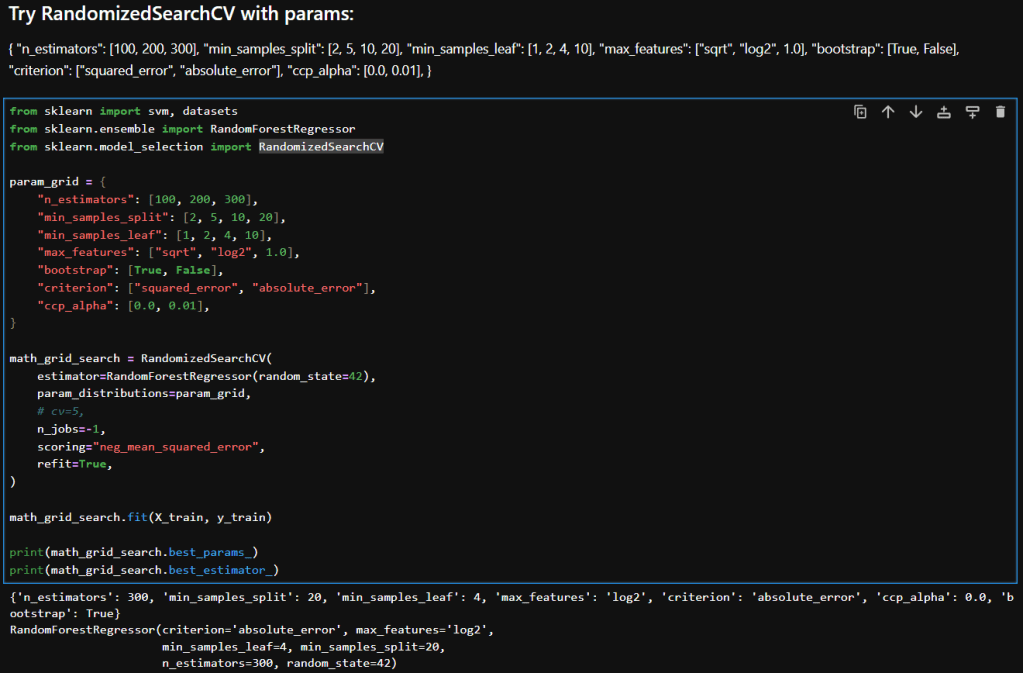
Hyperparameter Tuning with RandomizedSearchCV
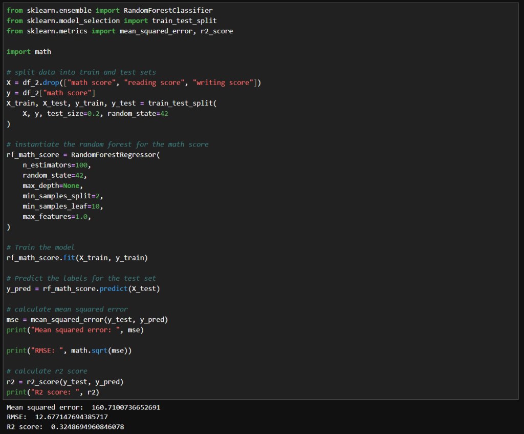
Here’s a breakdown of each parameter in my param_distributions for RandomizedSearchCV when tuning a RandomForestRegressor:
| Parameter | Description |
|---|---|
n_estimators [100, 200, 300] | Number of trees in the forest. More trees can improve performance but increase training time. |
min_samples_split [2, 5, 10, 20] | Minimum number of samples required to split an internal node. Higher values reduce model complexity and help prevent overfitting. |
min_samples_leaf [1, 2, 4, 10] | Minimum number of samples required to be at a leaf node. Larger values smooth the model and reduce variance. |
max_features ["sqrt", "log2", 1.0] | Number of features to consider when looking for the best split. "sqrt" and "log2" are common heuristics; 1.0 uses all features. |
bootstrap [True, False] | Whether bootstrap samples are used when building trees. True enables bagging; False uses the entire dataset for each tree. |
criterion ["squared_error", "absolute_error"] | Function to measure the quality of a split. "squared_error" (default) is sensitive to outliers; "absolute_error" is more robust. |
ccp_alpha [0.0, 0.01] | Complexity parameter for Minimal Cost-Complexity Pruning. Higher values prune more aggressively, simplifying the model. |

Interpretation
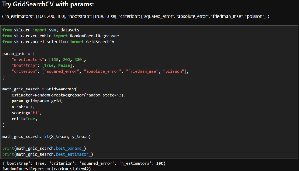
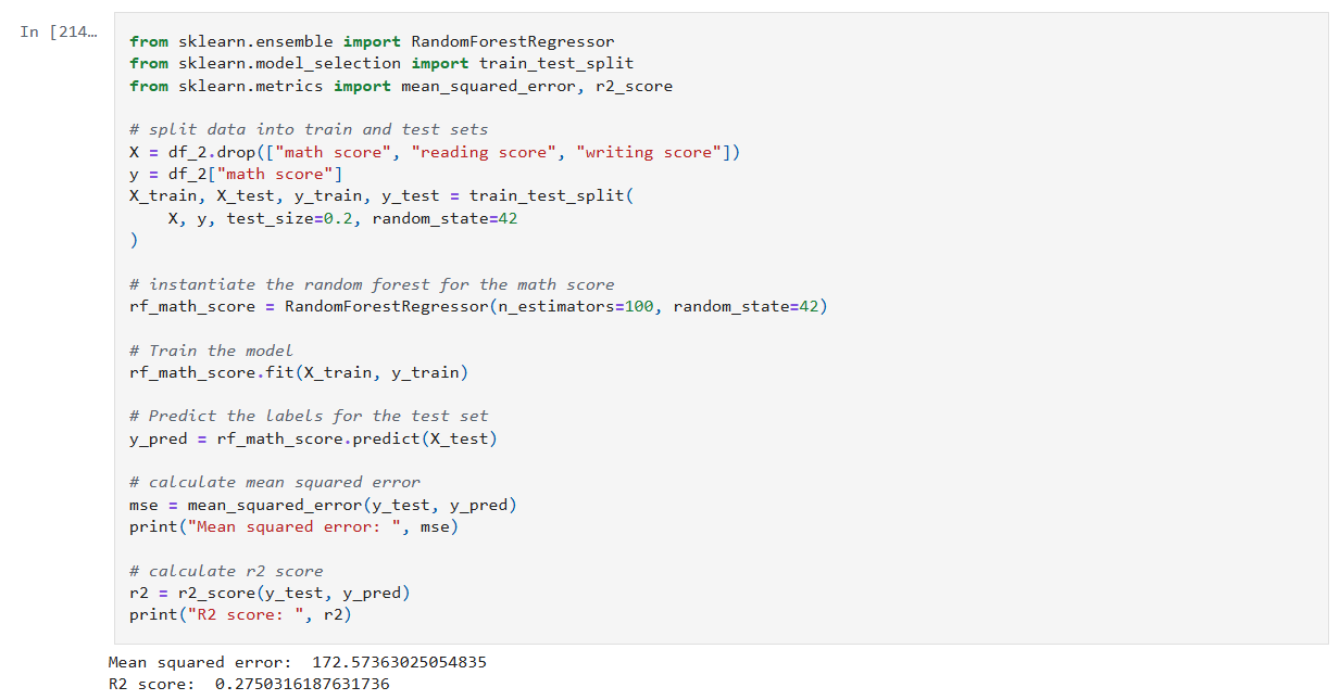
Here is a table that compares the results in my previous post where I experimented with GridSearchCV with what I achieved while using RandomizedSearchCV.
| Metric | GridSearchCV | RandomizedSearchCV | Improvement |
|---|---|---|---|
| Mean Squared Error (MSE) | 173.39 | 161.12 | ↓ 7.1% |
| Root Mean Squared Error (RMSE) | 13.17 | 12.69 | ↓ 3.6% |
| R² Score | 0.2716 | 0.3231 | ↑ 18.9% |
Interpretation & Insights
Lower MSE and RMSE:
RandomizedSearchCV yielded a model with noticeably lower error metrics. The RMSE dropped by nearly half a point, indicating better predictions. While the absolute reduction may seem modest, it’s meaningful in contexts where small improvements translate to better decision-making or cost savings.
Higher R² Score:
The R² score improved from 0.27 to 0.32, a relative gain of nearly 19%. This suggests that the model tuned via RandomizedSearchCV explains more variance in the target variable—an encouraging sign of better generalization.
Efficiency vs Exhaustiveness:
GridSearchCV exhaustively evaluated all parameter combinations, which can be computationally expensive and potentially redundant. In contrast, RandomizedSearchCV sampled a subset of combinations and still outperformed grid search. This underscores the value of strategic randomness in high-dimensional hyperparameter spaces.
Model Robustness:
The improved metrics hint that RandomizedSearchCV may have landed on a configuration that better balances bias and variance—possibly due to more diverse sampling across parameters like min_samples_leaf, criterion, and ccp_alpha.
Takeaways
RandomizedSearchCV not only delivered better predictive performance but did so with greater computational efficiency. When I ran GridSearchCV with as many parameters to explore, it ran for a long time. In contrast, RandomizedSearchCV returned almost instantaneously in comparison. For large or complex models like RandomForestRegressor, this approach offers a good balance between exploration and practicality. It’s a great reminder that smarter search strategies can outperform brute-force methods—especially when paired with thoughtful parameter ranges.
– William