

In this post, I’ll walk through my first notebook exploring random forests. I’m using a dataset I found on Kaggle. It can be found here: https://www.kaggle.com/datasets/whenamancodes/students-performance-in-exams/data.
This is a small, simulated dataset that contains data for gender, ethnicity, the level of education attained by the parents, the lunch (free or standard), whether the student took test preparation courses and the scores for math, reading and writing.
I’ll try my hand at using random forests to understand the importance of various features on student performance.
Step 1: Clean up the data
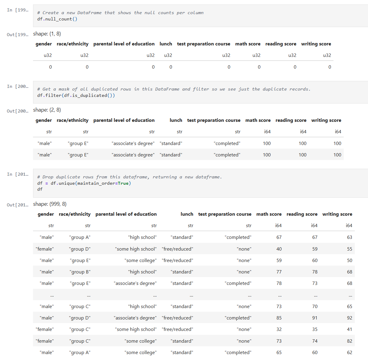
After reading the data into a Dataframe, we do a quick check on the quality of the data. I check for simple things like empty values and duplicates using Polars APIs.
Below is the code from our notebook cell:
In these cells:
- Check for null data.
- Check for duplicate rows and remove the duplicates.
This makes sure we correct and, or remove any bad data before we start processing.
Step 2: Inspect the data
Now that the data is cleaned up, we can create some visualizations of the data. The first I’ll create are some histograms of the math, reading and writing scores. Histograms are one of the most foundational, and surprisingly powerful, visual tools in a data scientist’s toolkit.
Below is the code from three notebook cells to generate the histograms:
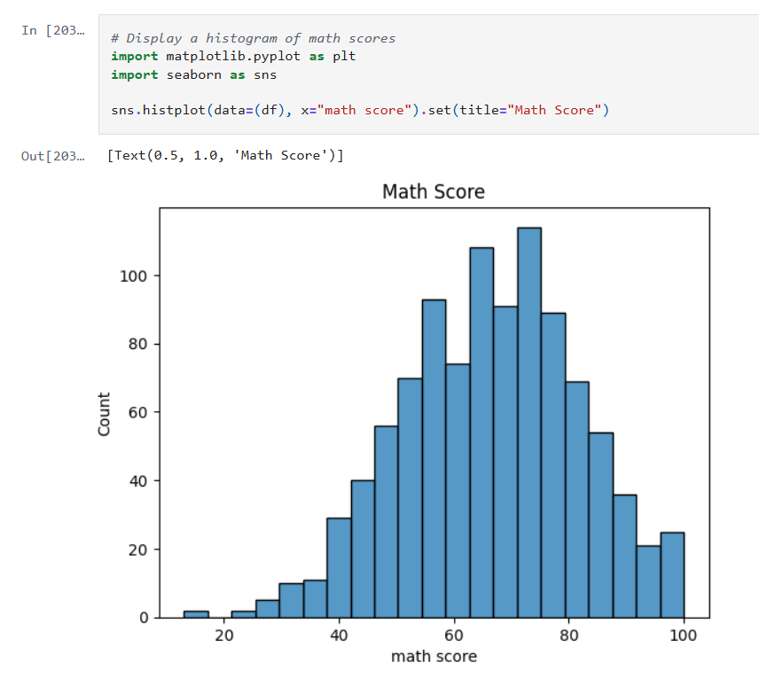


Histograms allow us to:
- See whether the data is symmetrical or not.
- See if there are a lot of outliers that could impact model performance.
Next we’ll look at some boxplots. Boxplots are good for summarizing the distribution of the data.
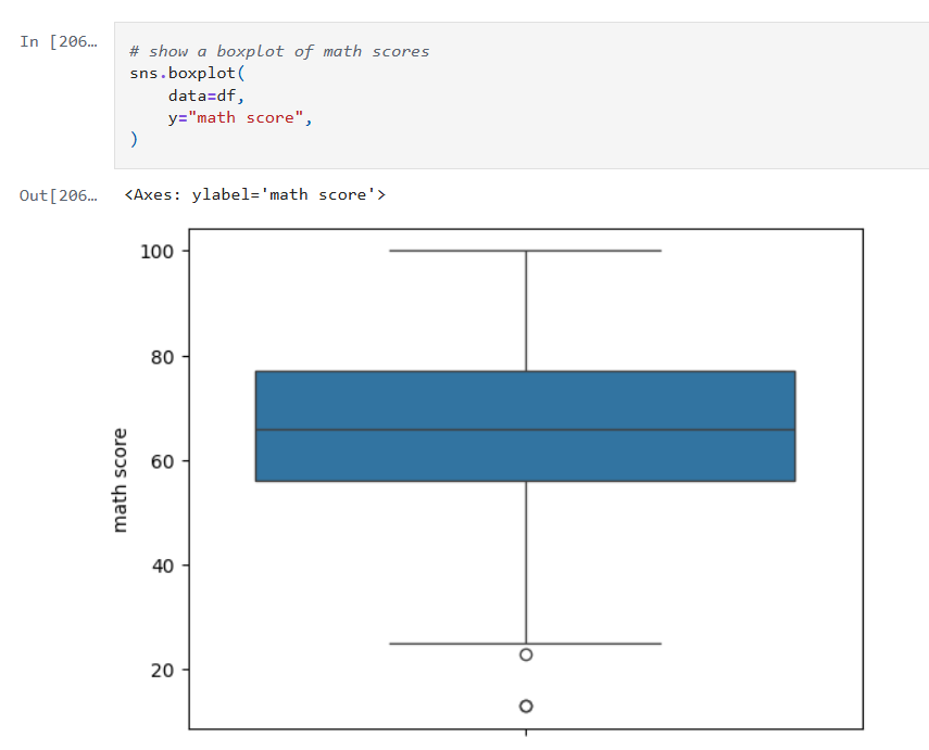

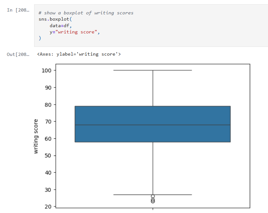
Boxplots allow us to visualize:
- The median value of our features. The median represents the central tendency.
- The interquartile range (IQR), showing the middle 50% of data.
- The min and max values (excluding outliers).
- Data outliers. Outliers are represented by the circles outside of 1.5 * the IQR.
- Assess skewness. We can see of the median is very close to the top or bottom of the box.
Next, we’ll look a heatmap. Heatmaps (or heatplots) are really powerful data visualizations, they let you see relationships between variables at a glance, especially when you’re dealing with large datasets or multiple features.

Heatmaps allow us to visualize:
- Correlations: Bright colors show strong positive or negative correlations while faded or neutral colors imply weak or no relationship.
- Spotting Patterns: We can quickly identify where performance clusters, or drops, occur.
- Identifying Anomalies: Visual blips can point to data quality problems.
Step 3: Encoding Categorical Variables
The next step is to convert our categorical columns to a numeric format using scikit-learn’s LabelEncoder.
Below is the code from our notebook cell:

In that cell:
- I instantiate a
LabelEncoderobject. - I get the names of the columns that need to be encoded by iterating over the columns in the dataframe and filtering where the type of the column is a string.
- I create encoded data for each of those columns with a new name appended with “_num”.
- Lastly I create a new dataframe that combines the new columns I created with the original dataframe.
Step 4: Remove the non-numeric columns
This is a simple step, where I simply select the columns that are integers.
Below is the code from our notebook cell:
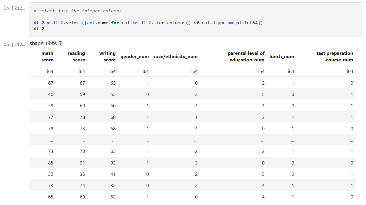
In that cell:
- Iterate over the columns, filtering where the type is integer and use that list in the select function.
Now we can create a heatmap that includes the encoded data too.

Step 5: Train models for math, reading and writing
Now it’s time to build, train, and evaluate our model. I repeat this step for each of the math, reading and writing scores. I’ll only show the math cell here as they do the same thing.
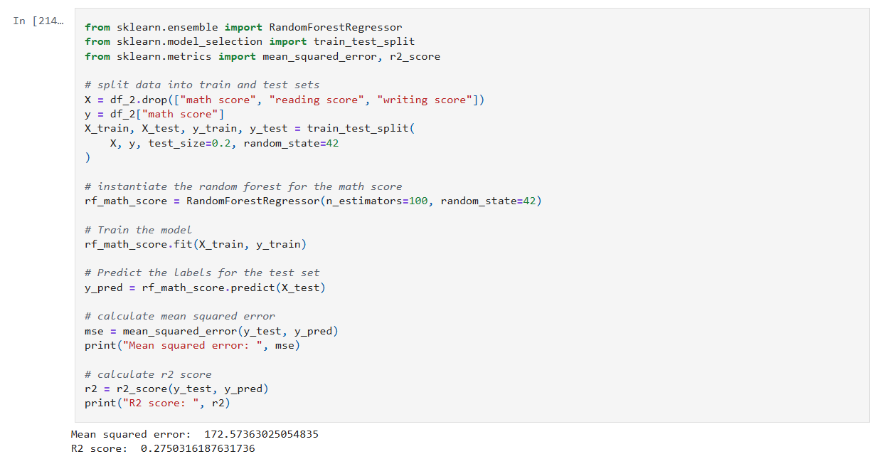
In that cell:
- Drop the score columns from the dataframe.
- Choose “math score” as my category column.
- Split the data and create a RandomForestRegressor model.
- Train the model against the data.
- Use the model to predict values and measure the accuracy.
The r2 score gives a sense of how well the predictors capture the ups-and-downs in your target. Or: How much better is my model at predicting Y than just guessing the average of Y every time?
- R² = 1: indicates a perfect fit.
- R² = 0: the model is no better than predicting the mean.
- R² < 0: the model is worse than the mean.
Step 6: Visualize feature importance to the math score
Now we can create a histogram to visualize the relative importance of our features to the math score.

In that cell:
- I grab all the feature columns.
- Map the columns to the models
feature_importances_value. - Generate a plot.
The higher the value in feature_importances_, the more important the feature.
Final Thoughts and Next Steps
In this first step into learning about Random Forests we can see they are powerhouse in the world of data science. Random Forests are built on the idea of “wisdom of the crowd”, by combining many decision trees trained on random subsets of data and features, they reduce overfitting and improve generalization.
The new Jupyter notebook can be found here in my GitHub.
– William