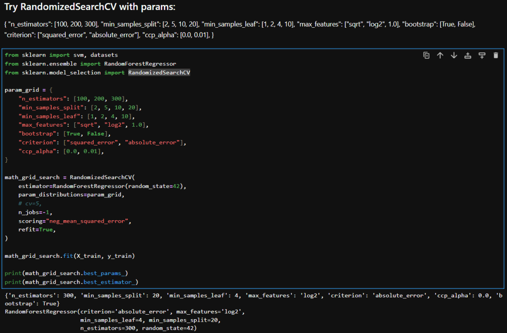
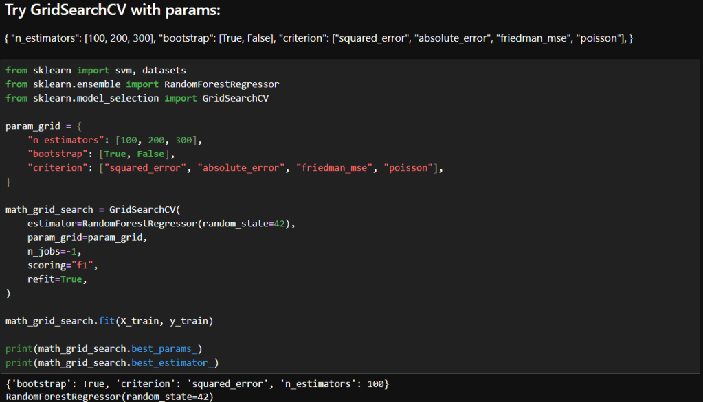
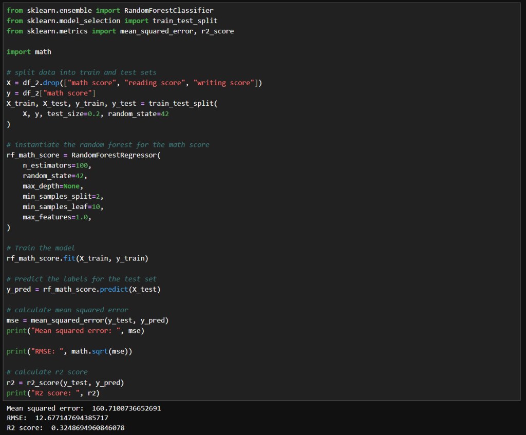
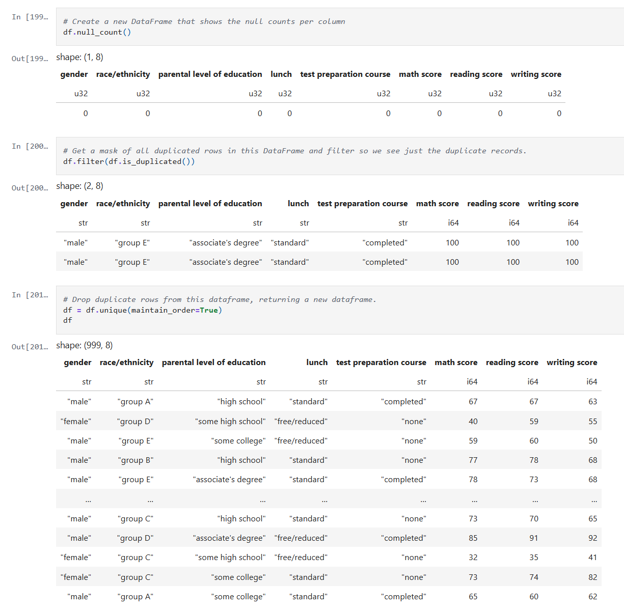
Tag: Machine Learning in Education

  • Playing with Hyperparameter Tuning and Winsorizing

    Playing with Hyperparameter Tuning and Winsorizing

    In this post, I’ll revisit my earlier model’s performance by experimenting with hyperparameter tuning, pushing beyond default configurations to extract deeper predictive power. I’ll also take a critical look at the data itself, exploring how winsorizing outliers can recalibrate outliers without sacrificing the integrity of the data. The goal: refine, rebalance, and rethink accuracy.

    Hyperparameter Tuning

    The image below shows my initial experiment with the RandomForestRegressor. As you can see, I used the default value for n_estimators.

    The resulting MSE, RMSE and R² score are shown. In my earlier post I noted what those values mean. In summary:

    • An MSE of 172 indicates there may be outliers.
    • An RMSE of 13 indicates there an average error of around 13 points on 0–100 scale.
    • An R² of 0.275 means my model explains just 27.5% of the variance in the target variable.

    Experimentation

    My first attempt at manual tuning looked like the image below. There really is just a small improvement with these parameters. I tried increasing n_estimators significantly because the accuracy should be improved with the larger value. I tried increasing max_depth to 50 to see if that compares to the default value of None. I tried increasing min_samples_split to 20 and min_samples_leaf of 10 to see if it would help with any noise in the data. I didn’t really need to set max_features to 1.0, because that is currently the default value.

    The net result was slightly better results, but nothing too significant.

    Next, I tried what is shown in the image below. Interestingly, I got very similar results to the above. With these values, the model trains much faster while achieving the same results.

    Winsorizing

    Winsorization changes a dataset by replacing outlier values with less extreme ones. Unlike trimming (which removes outliers), winsorization preserves the dataset size by limiting values at the chosen threshold.

    Here is what my code looks like:

    In this cell, I’ve replaced the math score data a winsorized version. I used the same hyperparameters as before. Here we can see a more significant improvement MSE and RMSE, but a slightly lower R² score.

    That means that since the earlier model has a slightly higher R², it explains a bit more variance relative to the total variance of the target variable. Maybe because it models the core signal more tightly, even though it has noisier estimates.

    The winsorized model, with its lower MSE and RMSE indicate better overall prediction accuracy. This is nice when minimizing absolute error matters the most.

    Final Thoughts

    After experimenting with default settings, I systematically adjusted hyperparameters and applied winsorization to improve my RandomForestRegressor’s accuracy. Here’s a concise overview of the three main runs:

    • Deep, Wide Forest
      • Parameters
        • max_depth: 50
        • min_samples_split: 20
        • min_samples_leaf: 10
        • max_features: 1.0
        • random_state: 42
      • Insights
        • A large ensemble with controlled tree depth and higher split/leaf thresholds slightly reduced variance but yielded only marginal gains over defaults.
    • Standard Forest with Unlimited Depth
      • Parameters
        • max_depth: None
        • min_samples_split: 2
        • min_samples_leaf: 10
        • max_features: 1.0
        • random_state: 42
      • Insights
        • Reverting to fewer trees and no depth limit produced nearly identical performance, suggesting diminishing returns from deeper or wider forests in this setting.
    • Winsorized Data
      • Parameters
        • n_estimators: 100
        • max_depth: None
        • min_samples_split: 2
        • min_samples_leaf: 10
        • max_features: 1.0
        • random_state: 42
        • Applied winsorization to cap outliers
      • Insights
        • Winsorizing outliers drastically lowered absolute error (MSE/RMSE), highlighting its power for stabilizing predictions. The slight drop in R² reflects reduced target variance after capping extremes.

    – William

  • Analyzing the Random Forest Results

    Analyzing the Random Forest Results

    In this post, I’ll go back and take a look at the results of my earlier post on Random Forests, interpret the performance metrics, try to diagnose problems and identify some techniques I can apply to improve the results.

    Math Score Performance Metrics Summary

    The table below is a summary of the results of the math score analysis from my previous post.

    MetricValueInterpretation
    Mean Squared Error (MSE)172MSE is the average of the squared differences between predicted values and actual values. Since the differences are squared, large errors are penalized more.
    Root MSE (RMSE)≈ 13.11Average error ~13.11 points on 0–100 scale. This means that your model’s predictions are off by roughly 13.1 points on average, which is easier to reason about on a 0–100 scale.
    R² Score0.275Explains ~27.5% of target variance. An R² of 0.275 means my model explains just 27.5% of the variance in the target variable.
    Target Range0 – 100Maximum possible variation is 100 points.

    Interpreting the Numbers

    My RMSE of around 13.1 points means that my predictions are off by 13 units out of 100. That’s the same as a 13% error. The seems pretty high, since that is more than a grade level!

    An R² of 0.275 says that my model captures only 27.5% of the variability in the target. The rest, 72.5%, is unexplained. That means either the dataset is missing features that could help with predictions, or there is a lot of noise in the data, or model is still underfitting.

    Diagnosing Underlying Issues

    • Feature Limitations
      Important variables could be missing, or existing ones may need to be transformed.
    • Data Quality
      Outliers will inflate MSE. Also, how the data is sampled across the target 0–100 range can also impact performance.
    • Model Complexity
      Default hyperparameters, which is what I used, often underfit. The trees may be too shallow (max_depth too low) or too few (n_estimators too small) to capture complex patterns that may exist in the dataset.

    Strategies to Improve Accuracy

    • Revisit Hyperparameter Tuning
      • Try to optimize things like n_estimators, max_depth, etc.
    • Feature Engineering
      • Explore encoding some features.
    • Data Augmentation & Cleaning
      • Look into removing or ‘winsorizing’ outliers.
      • Try to balance samples across target so the distribution isn’t lopsided.
    • Alternative Models & Ensembles
      • Inspect stacking multiple regressors (e.g., combine RF with SVR or k-NN).
      • Use bagging with different tree depths or feature subsets.
    • Robust Validation
      • Monitor training and validation RMSE/R² to detect under/overfitting.

    Final Thoughts and Next Steps

    My first step into learning Random Forests using default parameters didn’t provide the desired accuracy. Researching the possibles cases and techniques to improve accuracy has provided me some direction. In my next post I’ll show how I applied the above and what impact these techniques had on the accuracy of the models.

    – William

  • Using Random Forests to analyze student performance

    Using Random Forests to analyze student performance

    In this post, I’ll walk through my first notebook exploring random forests. I’m using a dataset I found on Kaggle. It can be found here: https://www.kaggle.com/datasets/whenamancodes/students-performance-in-exams/data.

    This is a small, simulated dataset that contains data for gender, ethnicity, the level of education attained by the parents, the lunch (free or standard), whether the student took test preparation courses and the scores for math, reading and writing.

    I’ll try my hand at using random forests to understand the importance of various features on student performance.

    Step 1: Clean up the data

    After reading the data into a Dataframe, we do a quick check on the quality of the data. I check for simple things like empty values and duplicates using Polars APIs.

    Below is the code from our notebook cell:

    In these cells:

    • Check for null data.
    • Check for duplicate rows and remove the duplicates.

    This makes sure we correct and, or remove any bad data before we start processing.

    Step 2: Inspect the data

    Now that the data is cleaned up, we can create some visualizations of the data. The first I’ll create are some histograms of the math, reading and writing scores. Histograms are one of the most foundational, and surprisingly powerful, visual tools in a data scientist’s toolkit.

    Below is the code from three notebook cells to generate the histograms:

    Histograms allow us to:

    • See whether the data is symmetrical or not.
    • See if there are a lot of outliers that could impact model performance.

    Next we’ll look at some boxplots. Boxplots are good for summarizing the distribution of the data.

    Boxplots allow us to visualize:

    • The median value of our features. The median represents the central tendency.
    • The interquartile range (IQR), showing the middle 50% of data.
    • The min and max values (excluding outliers).
    • Data outliers. Outliers are represented by the circles outside of 1.5 * the IQR.
    • Assess skewness. We can see of the median is very close to the top or bottom of the box.

    Next, we’ll look a heatmap. Heatmaps (or heatplots) are really powerful data visualizations, they let you see relationships between variables at a glance, especially when you’re dealing with large datasets or multiple features.

    Heatmaps allow us to visualize:

    • Correlations: Bright colors show strong positive or negative correlations while faded or neutral colors imply weak or no relationship.
    • Spotting Patterns: We can quickly identify where performance clusters, or drops, occur.
    • Identifying Anomalies: Visual blips can point to data quality problems.

    Step 3: Encoding Categorical Variables

    The next step is to convert our categorical columns to a numeric format using scikit-learn’s LabelEncoder.

    Below is the code from our notebook cell:

    In that cell:

    • I instantiate a LabelEncoder object.
    • I get the names of the columns that need to be encoded by iterating over the columns in the dataframe and filtering where the type of the column is a string.
    • I create encoded data for each of those columns with a new name appended with “_num”.
    • Lastly I create a new dataframe that combines the new columns I created with the original dataframe.

    Step 4: Remove the non-numeric columns

    This is a simple step, where I simply select the columns that are integers.

    Below is the code from our notebook cell:

    In that cell:

    • Iterate over the columns, filtering where the type is integer and use that list in the select function.

    Now we can create a heatmap that includes the encoded data too.

    Step 5: Train models for math, reading and writing

    Now it’s time to build, train, and evaluate our model. I repeat this step for each of the math, reading and writing scores. I’ll only show the math cell here as they do the same thing.

    In that cell:

    • Drop the score columns from the dataframe.
    • Choose “math score” as my category column.
    • Split the data and create a RandomForestRegressor model.
    • Train the model against the data.
    • Use the model to predict values and measure the accuracy.

    The r2 score gives a sense of how well the predictors capture the ups-and-downs in your target. Or: How much better is my model at predicting Y than just guessing the average of Y every time?

    • R² = 1: indicates a perfect fit.
    • R² = 0: the model is no better than predicting the mean.
    • R² < 0: the model is worse than the mean.

    Step 6: Visualize feature importance to the math score

    Now we can create a histogram to visualize the relative importance of our features to the math score.

    In that cell:

    • I grab all the feature columns.
    • Map the columns to the models feature_importances_ value.
    • Generate a plot.
    The higher the value in feature_importances_, the more important the feature.

      Final Thoughts and Next Steps

      In this first step into learning about Random Forests we can see they are powerhouse in the world of data science. Random Forests are built on the idea of “wisdom of the crowd”, by combining many decision trees trained on random subsets of data and features, they reduce overfitting and improve generalization.

      The new Jupyter notebook can be found here in my GitHub.

      – William

    • Deep Dive Into Random Forests

      Deep Dive Into Random Forests

      In today’s post, I’ll take an in-depth look at Random Forests, one of the most popular and effective algorithms in the data science toolkit. I’ll describe what I learned about how they work, their components and what makes them tick.

      What Are Random Forests?

      At its heart, a random forest is an ensemble of decision trees working together.

      • Decision Trees: Each tree as a model that makes decisions by splitting data based on certain features.
      • Ensemble Approach: Instead of relying on a single decision tree, a random forest builds many trees from bootstrapped samples of your data. The prediction from the forest is then derived by averaging (for regression) or taking a majority vote (for classification).

      This approach reduces the variance typical of individual trees and builds a robust model that handles complex feature interactions with ease.

      The Magic Behind the Method

      1. Bootstrap Sampling

      Each tree in the forest is trained on a different subset of data, selected with replacement. This process, known as bagging (Bootstrap Aggregating), means roughly 37% of your data isn’t used in any tree. This leftover data, the out-of-bag (OOB) set, can later be used to internally validate the model without needing a separate validation set.

      2. Random Feature Selection

      At every decision point within a tree, instead of considering every feature, the algorithm randomly selects a subset. This randomness:

      • De-correlates Trees: Each tree becomes less alike, ensuring that the ensemble doesn’t overfit or lean too heavily on one feature.
      • Reduces Variance: Averaging predictions across diverse trees smooths out misclassifications or prediction errors.

      3. Aggregating Predictions

      For classification tasks, each tree casts a vote for a class, and the class with the highest number of votes becomes the model’s prediction.

      For regression tasks, predictions are averaged to produce a final value. This collective approach generally results in higher accuracy and more stable predictions.

      Out-of-Bag (OOB) Error

      An important feature of random forests is the OOB error estimate.

      • What It Is: Each tree is trained on a bootstrap sample, leaving out a set of data that can serve as a mini-test set.
      • Why It Counts: Aggregating predictions on these out-of-bag samples can offer an estimate of the model’s test error.

      This feature can be really handy, especially when you’re working with limited data and want to avoid setting aside a large chunk of it for validation.

      Feature Importance

      Random forests don’t just predict, they can also help you understand your data:

      • Mean Decrease in Impurity (MDI): This measure tallies how much each feature decreases impurity (based on measures like the Gini index) across all trees.
      • Permutation Importance: By shuffling features and measuring the drop in accuracy the importance of a feature can be measured. This is meant to help when you need to interpret the model and communicate which features are most influential.

      Pros and Cons

      Advantages:

      • Can handle Non-Linear Data: Naturally captures complex feature interactions.
      • Can handle Noise & Outliers: Ensemble averaging minimizes overfitting.
      • Doesn’t need a lot of Preprocessing: No need for extensive data scaling or transformation.

      Disadvantages:

      • Can be Memory Intensive: Storing hundreds of trees can be demanding.
      • Slower than a single Tree: Compared to a single decision tree, the ensemble approach require more processing power.
      • Harder to Interpret: The combination of multiple trees makes it harder to interpretability compared to individual trees.

      Summary

      Random Forests are a powerful next step in my journey. With their ability to reduce variance through ensemble learning and their built-in validation mechanisms like OOB error, they offer both performance and insight.

      In my next post, I’ll share how I apply the Random Forest technique to this data set: https://www.kaggle.com/datasets/whenamancodes/students-performance-in-exams/data

      – William

    • Experimenting with Model Stacking on Student Alcohol Consumption Data

      Experimenting with Model Stacking on Student Alcohol Consumption Data

      In this blog post, I’m building on my previous work with the Student Alcohol Consumption dataset on Kaggle. My latest experiments can be found in the updated Jupyter notebook. In this updated analysis, I explored several new approaches—including using linear regression, stacking models, applying feature transformations, and leveraging visualization—to compare model performances in both prediction and classification scenarios.

      Recap: From the Previous Notebook

      Before diving into the latest experiments, here’s a quick overview of what I did earlier:

      • I explored using various machine learning algorithms on the student alcohol dataset.
      • I identified promising model combinations and created baseline plots to display their performance.
      • My earlier analysis provided a solid framework for experimentation with stacking and feature transformation techniques.

      This post builds directly on that foundation.

      Experiment 1: Using Linear Regression

      Motivation:

      I decided to try a linear regression model because it excels at predicting continuous numerical values—like house prices or temperature. In this case, I was curious to see how well it could predict student grades or scaled measures of drinking behavior.

      What I Did:
      • I trained a linear regression model on the dataset.
      • I applied a StandardScaler to ensure that numeric features were well-scaled.
      • The predictions were then evaluated by comparing them visually (using plots) and numerically to other approaches.
      Observation:

      Interestingly, the LinearRegression model, when calibrated with the StandardScaler, yielded better results than using Gaussian Naive Bayes (GNB) alone. A plot of the predictions against actual values made it very clear that the linear model provided smoother and more reliable estimates.

      Experiment 2: Stacking Gaussian Naive Bayes with Linear Regression

      Motivation:

      I wanted to experiment with stacking models that are generally not used together. Despite the literature primarily avoiding a combination of Gaussian Naive Bayes with linear regression, I was intrigued by the possibility of capturing complementary characteristics of both:

      • GNB brings in a generative, probabilistic perspective.
      • Linear Regression excels in continuous predictions.
      What I Did:
      • I built a stacking framework where the base learners were GNB and linear regression.
      • Each base model generated predictions, which were then used as input (meta-features) for a final meta-model.
      • The goal was to see if combining these perspectives could offer better performance than using either model alone.
      Observation:

      Stacking GNB with linear regression did not appear to improve results over using GNB alone. The combined predictions did not outperform linear regression’s stand-alone performance, suggesting that in this dataset the hybrid approach might have introduced noise rather than constructive diversity in the predictions.

      Experiment 3: Stacking Gaussian Naive Bayes with Logistic Regression

      Motivation:

      While exploring stacking architectures, I found that combining GNB with logistic regression is more common in the literature. Since logistic regression naturally outputs calibrated probabilities and aligns well with classification tasks, I hoped that:

      • The generative properties of GNB would complement the discriminative features of logistic regression.
      • The meta-model might better capture the trade-offs between these approaches.
      What I Did:
      • I constructed a stacking model where the two base learners were GNB and logistic regression.
      • Their prediction probabilities were aggregated to serve as inputs to the meta-learner.
      • The evaluation was then carried out using test scenarios similar to those in my previous notebook.
      Observation:

      Even though the concept seemed promising, stacking GNB with logistic regression did not lead to superior results. The final performance of the stack was not significantly better than what I’d seen with GNB alone. In some cases, the combined output underperformed compared to linear regression alone.

      Experiment 4: Adding a QuantileTransformer

      Motivation:

      A QuantileTransformer remaps features to follow a uniform or a normal distribution, which can be particularly useful when dealing with skewed data or outliers. I introduced it into the stacking pipeline because:

      • It might help models like GNB and logistic regression (which assume normality) to produce better-calibrated probability outputs.
      • It provides a consistent, normalized feature space that might enhance the meta-model’s performance.
      What I Did:
      • I added the QuantileTransformer as a preprocessing step immediately after splitting the data.
      • The transformed features were used to train both the base models and the meta-learner in the stacking framework.
      Observation:

      Surprisingly, the introduction of the QuantileTransformer did not result in a noticeable improvement over the GNB results without the transformer. It appears that, at least under my current experimental settings, the transformed features did not bring out the expected benefits.

      Experiment 5: Visualizing Model Results with Matplotlib

      Motivation:

      Visual analysis can often reveal trends and biases that plain numerical summaries might miss. Inspired by examples on Kaggle, I decided to incorporate plots to:

      • Visually compare the performance of different model combinations.
      • Diagnose potential issues such as overfitting or miscalibration.
      • Gain a clearer picture of model behavior across various scenarios.
      What I Did:
      • I used Matplotlib to plot prediction distributions and error metrics.
      • I generated side-by-side plots comparing the predictions from linear regression, the stacking models, and GNB alone.
      Observation:

      The plots proved invaluable. For instance, a comparison plot clearly highlighted that linear regression with StandardScaler outperformed the other approaches. Visualization not only helped in understanding the behavior of each model but also served as an effective communication tool for sharing results.

      Experiment 6: Revisiting Previous Scenarios with the Stacked Model

      Motivation:

      To close the loop, I updated my previous analysis function to use the stacking model that combined GNB and logistic regression. I reran several test scenarios and generated plots to directly compare these outcomes with earlier results.

      What I Did:
      • I modified the function that earlier produced performance plots.
      • I then executed those scenarios with the new stacked approach and documented the differences.
      Observation:

      The resulting plots confirmed that—even after tuning—the stacked model variations (both with linear regression and logistic regression) did not surpass the performance of linear regression alone. While some combinations were competitive, none managed to outshine the best linear regression result that I had seen earlier.

      Final Thoughts and Conclusions

      This journey into stacking models, applying feature transformations, and visualizing the outcomes has been both enlightening and humbling. Here are my key takeaways:

      • LinearRegression Wins (for Now): The linear regression model, especially when combined with a StandardScalar, yielded better results compared to using GNB or any of the stacked variants.
      • Stacking Challenges:
        • GNB with Linear Regression: The combination did not improve performance over GNB alone.
        • Stacking GNB with Logistic Regression: Although more common in literature, this approach did not lead to a significant boost in performance in my first attempt.
      • QuantileTransformer’s Role: Despite its promise, the QuantileTransformer did not produce the anticipated improvements. Its impact may be more nuanced or require further tuning.
      • Visualizations Are Game Changers: Adding plots was immensely helpful to better understand model behavior, compare the effectiveness of different approaches, and provide clear evidence of performance disparities.
      • Future Directions: It’s clear that further experimentation is necessary. I plan to explore finer adjustments and perhaps more sophisticated stacking strategies to see if I can bridge the gap between these models.

      In conclusion, while I was hoping that combining GNB with logistic regression would yield better results, my journey shows that sometimes the simplest approach—in this case, linear regression with proper data scaling—can outperform more complex ensemble methods. I look forward to further refinements and welcome any ideas or insights from the community on additional experiments I could try.

      I hope you found this rundown as insightful as I did during the experimentation phase. What do you think—could there be yet another layer of transformation or model combination that might tip the scales? Feel free to share your thoughts, and happy modeling!

      – William

    • Exploring the Impact of Alcohol Consumption on Student Grades with Gaussian Naive Bayes

      Exploring the Impact of Alcohol Consumption on Student Grades with Gaussian Naive Bayes

      In today’s data-driven world, even seemingly straightforward questions can reveal surprising insights. In this post, I investigate whether students’ alcohol consumption habits bear any relationship to their final math grades. Using the Student Alcohol Consumption dataset from Kaggle, which contains survey responses on a myriad aspects of students’ lives—ranging from study habits and social factors to gender and alcohol use—I set out to determine if patterns exist that can predict academic performance.

      Dataset Overview

      The dataset originates from a survey of students enrolled in secondary school math and Portuguese courses. It includes rich, social, and academic information, such as:

      • Social and family background
      • Study habits and academic support
      • Alcohol consumption details during weekdays and weekends

      I focused on predicting the final math grade (denoted as G3 in the raw data) while probing how alcohol-related features, especially weekend consumption, might play a role in performance. The binary insight wasn’t just about whether students drank, but which drinking pattern might be more telling of their academic results.

      Data Preprocessing: Laying the Groundwork

      Before diving into modeling, the data needed some cleanup. Here’s how I systematically prepared the dataset for analysis:

      1. Loading the Data: I imported the CSV into a Pandas DataFrame for easy manipulation.
      2. Renaming Columns: Clarity matters. I renamed ambiguous columns for better readability (e.g., renaming walc to weekend_alcohol and dalc to weekday_alcohol).
      3. Label Encoding: Categorical data were converted to numeric representations using scikit-learn’s LabelEncoder, ensuring all features could be numerically processed.
      4. Reusable Code: I encapsulated the training and testing phases within a reusable function, which made it straightforward to test different feature combinations.

      Here’s are some snippets:

      In those cells:

      • I rename columns to make them more readable.
      • I instantiate a LabelEncoder object and encode a list of columns that have string values.
      • I add an absence category to normalize absence count a little due to how variable that data is.

      Experimenting With Gaussian Naive Bayes

      The heart of this exploration was to see how well a Gaussian Naive Bayes classifier could predict the final math grade based on different selections of features. Naive Bayes, while greatly valued for its simplicity and speed, operates under the assumption that features are independent—a condition that might not fully hold in educational data.

      Training and Evaluation Function

      To streamline the experiments, I wrote a function that:

      • Splits the data into training and testing sets.
      • Trains a GaussianNB model.
      • Evaluates accuracy on the test set.

      In that cell:

      • I create a function that:
        • Drops unwanted columns.
        • Runs 100 training cycles with the given data.
        • Captures the accuracy measured from each run and returns the average.

      Single and Two column sampling

      In those cells:

      • I get a list of all columns.
      • I create loop(s) over the column list and create a list of features to test.
      • I call my function to measure the the accuracy of the features at predicting student grades.

      Diving Into Feature Combinations

      I aimed to assess the predictive power by testing different combinations of features:

      1. All Columns: This gave the best accuracy of around 22%, yet it was clear that even the full spectrum of information struggled to make strong predictions.
      2. Handpicked Features: I manually selected features that I hypothesized might be influential. The resulting accuracy dipped below that of the full dataset.
      3. Individual Features: Evaluating each feature solo revealed that the column indicating whether students planned to pursue higher education yielded the highest individual accuracy—though still far lower than all features combined.
      4. Two-Feature Combinations: By testing all pairs, I noticed that combinations including weekend alcohol consumption appeared in the top 20 predictive pairs four times, including in both of the top two.
      5. Three-Feature Combinations: The trend became stronger—combinations featuring weekend alcohol consumption topped the list ten times and were present in each of the top three combinations!
      6. Four-Feature Combinations: Here, weekend alcohol consumption featured in the top 20 combination results even more robustly—15 times in total.

      These experiments showcased one noteworthy pattern: weekend alcohol consumption consistently emerged as a common denominator in the best-performing feature combinations, while weekday consumption rarely made an appearance.

      Analysis of the Findings

      Several key observations emerged from this series of experiments:

      • Predictive Accuracy: Even with the full set of features, the best accuracy reached was only around 22%. This underwhelming performance is indicative of the challenges posed by the dataset and the restrictive assumptions embedded within the Naive Bayes model.
      • Role of Alcohol Consumption: The repeated appearance of weekend alcohol consumption in high-ranking feature combinations suggests a potential association—it may capture lifestyle or social habits that indirectly correlate with academic performance. However, it is not a standalone predictor; rather, it seems to be relevant as part of a multifactorial interaction.
      • Model Limitations: The Gaussian Naive Bayes classifier assumes feature independence. The complexities inherent in student performance—where multiple social, educational, and psychological factors interact—likely violate this assumption, leading to lower predictive performance.

      Conclusion and Future Directions

      While the Gaussian Naive Bayes classifier provided some interesting insights, especially regarding the recurring presence of weekend alcohol consumption in influential feature combinations, its overall accuracy was modest. Predicting the final math grade, a multifaceted outcome influenced by numerous interdependent factors, appears too challenging for this simplistic probabilistic model.

      Next Steps:

      • Alternative Machine Learning Algorithms: Investigating other approaches like decision trees, random forests, support vector machines, or ensemble methods may yield better performance.
      • Enhanced Feature Engineering: Incorporating interaction terms or domain-specific features might help capture the complex relationships between social habits and academic outcomes.
      • Broader Data Explorations: Diving deeper into other factors—such as study habits, parental support, and extracurricular involvement—could provide additional clarity.

      Final Thoughts and Next Steps

      This journey reinforced the idea that while Naive Bayes is a great tool for its speed and interpretability, it might not be the best choice for all datasets. More sophisticated models and careful feature engineering are necessary when dealing with some datasets like student academic performance.

      The new Jupyter notebook can be found here in my GitHub.

      – William

    • Leveraging Scikit-Learn and Polars to Test a Naive Bayes Classifier

      Leveraging Scikit-Learn and Polars to Test a Naive Bayes Classifier

      In today’s post, I use scikit-learn with the same sample dataset I used in the previous post. I need to use the LabelEncoder to encode the strings as numeric values and then the GaussianNB to train and testing a Gaussian Naive Bayes classifier model and to predict the class of an example record. While many tutorials use pandas, I use Polars for fast data manipulation alongside scikit-learn for model development.

      Understanding Our Data and Tools

      Remember that the dataset includes ‘features’ for height, weight, foot size. It also has a categorical field for gender. Because classifiers like Gaussian Naive Bayes require numeric inputs, I need to transform the string gender values into a numeric format.

      In my new Jupyter notebook I use two libraries:

      Scikit-Learn for its machine learning utilities. Specifically, LabelEncoder for encoding and GaussianNB for classification.

      Polars for fast, efficient DataFrame manipulations.

      Step 1: Encoding Categorical Variables

      The first step is to convert our categorical column (gender) to a numeric format using scikit-learn’s LabelEncoder. This conversion is vital because machine learning models generally can’t work directly with string labels.

      Below is the code from our first notebook cell:

      In that cell:

      • I instantiate a LabelEncoder object.
      • For every feature in columns_to_encode (in this case, just "gender"), I create a new Polars Series with the suffix "_num", containing the encoded numeric values.
      • Finally, I add these series as new columns to our original DataFrame.

      This ensures that our categorical data is transformed into a machine-friendly format, an also preserves the human-readable string values for future reference.

      Step 2: Mapping Encoded Values to Original Labels

      Once we’ve encoded the data, it’s important to retain the mapping between the original string values and their corresponding numeric codes. This mapping is particularly useful when you want to interpret or display the model’s predictions.

      The following code block demonstrates how to generate and view this mapping:

      In that cell:

      • I save the original "gender" column and its encoded counterpart "gender_num".
      • By grouping on "gender" and aggregating with the first encountered numeric value, I create a mapping from string labels to numerical codes.

      Step 3: Training and Testing the Gaussian Naive Bayes Classifier

      Now it’s time to build, train, and evaluate our model. I separate the features and target, split the data, and then initialize the classifier.

      In that cell:

      • Get the data to use in training: I drop the raw "gender" and its encoded version from the Dataframe (X) and save the encoded classification in (y).
      • Data Splitting: train_test_split is used to randomly partition the data into training and testing sets.
      • Model Training: A GaussianNB classifier is instantiated and trained on the training data using the fit() method.
      • Prediction and Evaluation: The model’s predictions on the test set (y_pred) are generated and compared against the true labels using accuracy_score. This gives us a quantitative measure of the model’s performance.

      Step 4: Classifying a New Record

      Now I can test it on the sample observation. Consider the following code snippet:

      In that cell:

      • Create Example Data: I define a new sample record (with features like height, weight, and foot size) and create a Polars DataFrame to hold this record.
      • Prediction: The classifier is then used to predict the gender (encoded as a number) for this new record.
      • Decoding: Use the gender_mapping to display the human-readable gender label corresponding to the model’s prediction.

      Final Thoughts and Next Steps

      This step-by-step notebook shows how to preprocess data, map categorical values, train a Gaussian Naive Bayes classifier, and test new data with the combination of Polars and scikit-learn.

      The new Jupyter notebook can be found here in my GitHub. If you follow the instructions in my previous post you can run this notebook for yourself.

      – William

    • What I learned about the Gaussian Naive Bayes Classifier

      What I learned about the Gaussian Naive Bayes Classifier

      Description of Gaussian Naive Bayes Classifier

      Naive Bayes classifiers are simple supervised machine learning algorithms used for classification tasks. They are called “naive” because they assume that the features are independent of each other, which may not always be true in real-world scenarios. The Gaussian Naive Bayes classifier is a type of Naive Bayes classifier that works with continuous data. Naive Bayes classifiers have been shown to be very effective, even in cases where the the features aren’t independent. They can also be trained even with small datasets and are very fast once trained.

      Main Idea: The main idea behind the Naive Bayes classifier is to use Bayes’ Theorem to classify data based on the probabilities of different classes given the features of the data. Bayes’ Theorem says that we can tell how likely something is to happen, based on what we already know about something else that has already happened.

      Gaussian Naive Bayes: The Gaussian Naive Bayes classifier is used for data that has a continuous distribution and does not have defined maximum and minimum values. It assumes that the data is distributed according to a Gaussian (or normal) distribution. In a Gaussian distribution the data looks like a bell curve if it is plotted. This assumption lets us use the Gaussian probability density function to calculate the likelihood of the data. Below are the steps needed to train a classifier and then use to to classify a sample record.

      Steps to Calculate Probabilities (the hard way):

      1. Calculate the Averages (Means):
        • For each feature in the training data, calculate the mean (average) value.
        • To calculate the mean the sum of the values are divided by the number of values.
      2. Calculate the Square of the Difference:
        • For each feature in the training data, calculate the square of the difference between each feature value and the mean of that feature.
        • To calculate the square of the difference we subtract the mean from a value and square the result.
      3. Sum the Square of the Difference:
        • Sum the squared differences for each feature across all data points.
        • Calculating this is easy, we just add up all the squared differences for each feature.
      4. Calculate the Variance:
        • Calculate the variance for each feature using the sum of the squared differences.
        • We calculate the variance by dividing the sum of the squares of the differences by the number of values minus 1.
      5. Calculate the Probability Distribution:
        • Use the Gaussian probability density function to calculate the probability distribution for each feature.
        • The formula for this is complicated! It goes like this:
          • First take: 1 divided by the square root of 2 times pi times the variance.
          • Multiply that by e to the power of -1 times the square of the value to test minus the mean of the value divided by 2 times the variance.
      6. Calculate the Posterior Numerators:
        • Calculate the posterior numerator for each class by multiplying the prior probability of the class with the probability distributions of each feature given the class.
      7. Classify the sample data:
        • The higher result from #6 is the result.

      I created a Jupyter notebook that performs these calculations based on this example I found on Wikipedia. Here is my notebook on GitHub. If you follow the instructions in my previous post you can run this notebook for yourself.

      – William

      References

      1. Wikipedia contributors. (2025, February 17). Naive Bayes classifier. In Wikipedia, The Free Encyclopedia. Retrieved from https://en.wikipedia.org/wiki/Naive_Bayes_classifier
      2. Wikipedia contributors. (2025, February 17). Variance: Population variance and sample variance. In Wikipedia, The Free Encyclopedia. Retrieved from https://en.wikipedia.org/wiki/Variance#Population_variance_and_sample_variance
      3. Wikipedia contributors. (2025, February 17). Probability distribution. In Wikipedia, The Free Encyclopedia. Retrieved from https://en.wikipedia.org/wiki/Probability_distribution
    • Initial Tool Selection and Setup

      Initial Tool Selection and Setup

      Installing Python on Windows

      The easiest way to install Python on Windows is to use the Windows Store, like this:

      1) Open a Command Prompt: Press the Windows and the S keys, then type cmd and press the Enter key.

      2) Install python: Type python in the command prompt and press the Enter key. This will open the Windows Store with the Python application. Click the install button to install Python.

      3) Check the installation: Run this command back in the command prompt: python --version

      Installing Key Libraries

      With Python installed, you can now install some essential data science libraries. Open Command Prompt or PowerShell and enter the following commands:

      1. Press the Windows button and the S button, type ‘cmd’ and hit enter to open a command shell.
      2. Now create a directory for this project, like C:\Projects\Jupyter, and change to that directory.
      3. Create a python virtual environment: python -m venv .venv
      4. Activate the virtual environment: .venv\scripts\activate
      5. To install polars: pip install polars
      6. To install Jupyter Lab: pip install jupyterlab
      7. To install Jupyter Notebook: pip install notebook
      8. We need to change the directory Jupyter uses to store it’s notebooks. To do that run this command in your Jupyter directory: jupyter notebook --generate-config
      9. The command will tell you where it created the configuration file. Open the file using Notepad and look for the line that has this: c.ServerApp.root_dir
      10. Uncomment the line by removing the # at the beginning of the line and change value to the Jupyter directory you created. The line should look like this: c.ServerApp.root_dir = 'C:\Work\Jupyter'
      11. Save and close the file.

      You can also install Black and use it to keep your code formatted like this:

      • Run this command: pip install black jupyter-black

      I’ll show how to use it in a notebook later.

      Note, you’ll need to run .venv\scripts\activate every time you open a new command shell.

      I’ve chosen to start off using Polars rather than Pandas because it is easy to use and much faster than Pandas.

      Creating and Running a Sample Jupyter Lab Notebook

      Now that you have your tools installed, let’s create and run a sample Jupyter Lab notebook:

      1) Open Jupyter Lab: In Command Prompt or PowerShell, activate the venv and then type: jupyter lab

      2) The URL to access the notebook is printed, so if it doesn’t open in your browser you can copy the address and go to it in your browser manually.

      3) Create a New Notebook: In Jupyter Lab, go to the Launcher tab and select “Python 3” under the Notebook section to create a new notebook.

      4) Add and Run Sample Code: In the new notebook, copy and paste the following code into a cell. You may need to remove the whitespace if you get an error:

      import polars as pl
      
      df = pl.DataFrame(
          {
              "foo": [1, 2, 3],
              "bar": [6, 7, 8],
              "ham": ["a", "b", "c"],
          }
      )
      
      df

      5) Run the Cell: Click the Run button (or press Ctrl + Enter) to execute the cell and see the output. You should see something that looks like this:

      shape: (3, 3)
      foo	bar	ham
      i64	i64	str
      1	6	"a"
      2	7	"b"
      3	8	"c"

    • Essential Tools and Services for My Data Science Learning Journey

      Essential Tools and Services for My Data Science Learning Journey

      Hello again, everyone! As I start on this journey into the world of data science, I want to share the tools and services I’ll be using. Each of these tools has features that make them valuable for data science applications. Let’s dive in and explore why they’re so valuable:

      GitHub.com

      GitHub is a web-based platform that allows developers to collaborate on code, manage projects, and track changes in their codebase using version control (Git). For data science, GitHub is incredibly useful because:

      • Collaboration: It lets me to collaborate with others on data science projects, share my work, and receive feedback from the community.
      • Version Control: I can keep track of changes in my code, experiment with different versions, and easily revert to previous states if needed.
      • Open-Source Projects: I can explore open-source data science projects, learn from others’ work, and contribute to the community.

      Kaggle.com

      Kaggle is a platform dedicated to data science and machine learning. It offers a wide range of datasets, competitions, and learning resources. Kaggle is a must-have for my journey because of its:

      • Datasets: Kaggle provides access to a vast collection of datasets across various domains, including education, which I plan to use for my projects.
      • Competitions: Participating in Kaggle competitions allows me to apply my skills to real-world problems, learn from others, and gain valuable experience.
      • Learning Resources: Kaggle offers tutorials, code notebooks, and forums where I can learn new techniques, ask questions, and improve my understanding of data science concepts.

      Python

      Python is a versatile and widely-used programming language in the data science community. Its popularity stems from several key features:

      • Readability: Python’s syntax is clean and easy to understand, making it an excellent choice for beginners.
      • Libraries: Python has many libraries and frameworks for data analysis, machine learning, and visualization, such as NumPy, pandas, and scikit-learn.
      • Community Support: The Python community is large and active, providing extensive documentation, tutorials, and forums to help me along my learning journey.

      Jupyter Labs

      Jupyter Labs is an interactive development environment that allows me to create and share documents containing live code, equations, visualizations, and narrative text. Its benefits for data science include:

      • Interactive Coding: I can write and execute code in small, manageable chunks, making it easier to test and debug my work.
      • Visualization: Jupyter Labs supports rich visualizations, enabling me to create and display graphs, charts, and plots within my notebooks.
      • Documentation: I can document my thought process, findings, and insights alongside my code, creating comprehensive and reproducible reports.

      Polars DataFrames

      Polars is a fast and efficient DataFrame library for Rust, which also has a Python interface. It is designed to handle large datasets and perform complex data manipulations. Polars is a valuable addition to my toolkit because of its:

      • Performance: Polars is optimized for performance, making it great for handling large datasets and performing computationally intensive tasks.
      • Memory Efficiency: It uses less memory compared to traditional DataFrame libraries, which will help when working with large data.
      • Flexible API: Polars provides a flexible and intuitive API that allows me to perform various data manipulation tasks, such as filtering, grouping, and aggregating data.

      Black

      Black is a code formatter for Python that ensures my code sticks to styling and readability standards. Black is an essential tool for my data science projects because of its:

      • Consistency: Black will automatically format my code to follow best practices, making it more readable and maintainable.
      • Efficiency: With Black taking care of formatting, I can focus on writing code and solving problems.
      • Integration: Black can be easily integrated with Jupyter Lab, so that my code remains consistently formatted within my notebooks.

      By leveraging these tools and services, I will be well-equipped to dive into the world of data science and tackle exciting projects. Stay tuned as I share my experiences and discoveries along the way!

      – William